THE PROJECT
Packaging and Branding Design –
Implementation of design thinking strategies to produce sustainable packaging design and brand development for everyone’s favourite pantry staple.
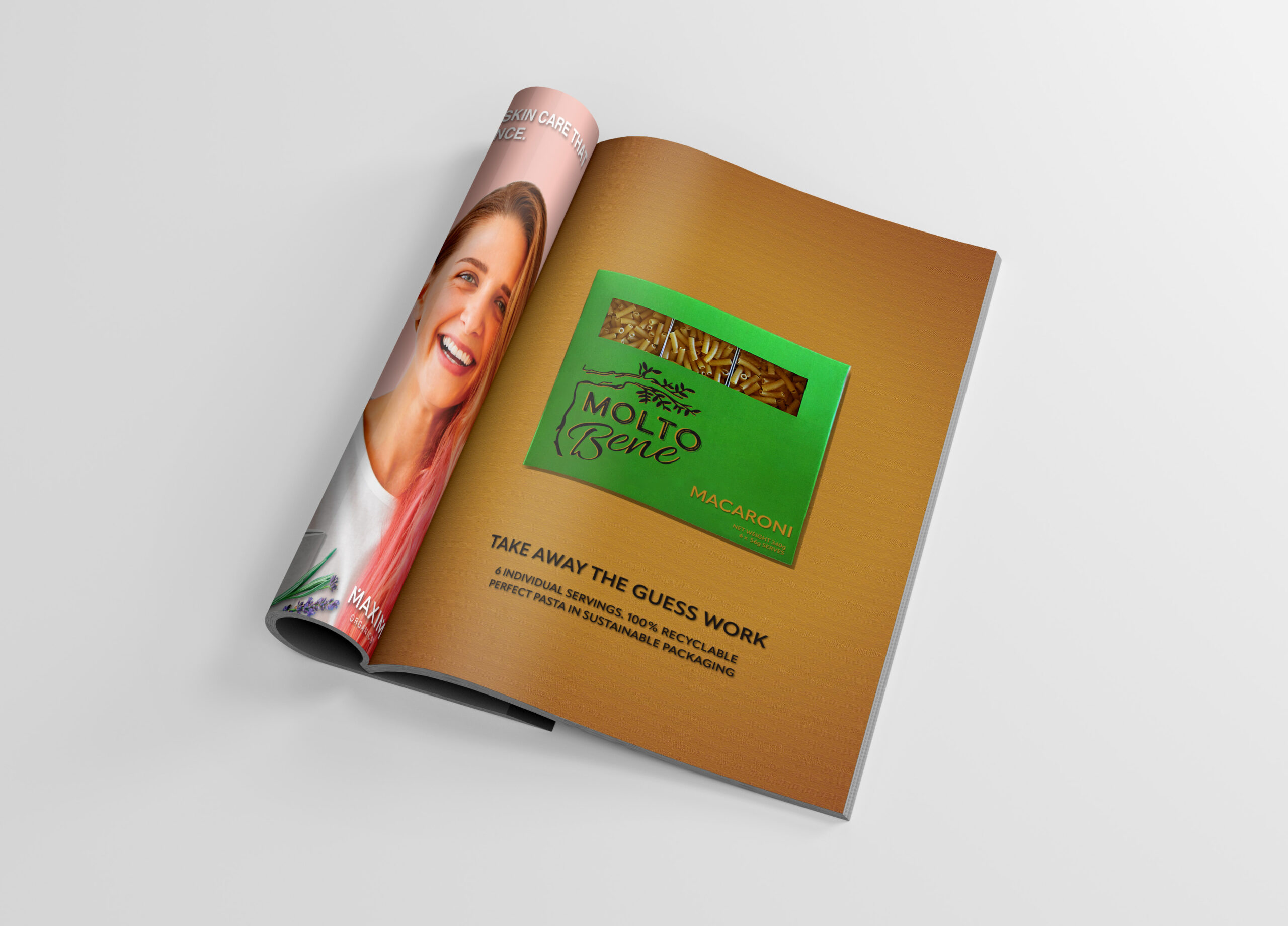
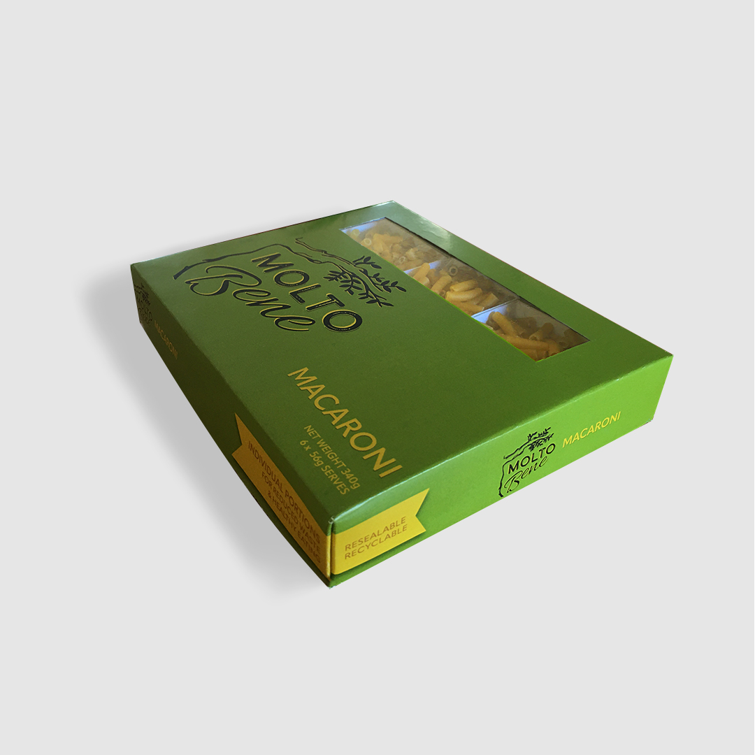
The result: MoltoBene comes in resealable, fully recyclable and partially compostable packaging making it great for the environment and your conscience. The packagings key features include it’s unique individual portion sizings, capacity for convenient storage and minimal waste.
LOGO DESIGN
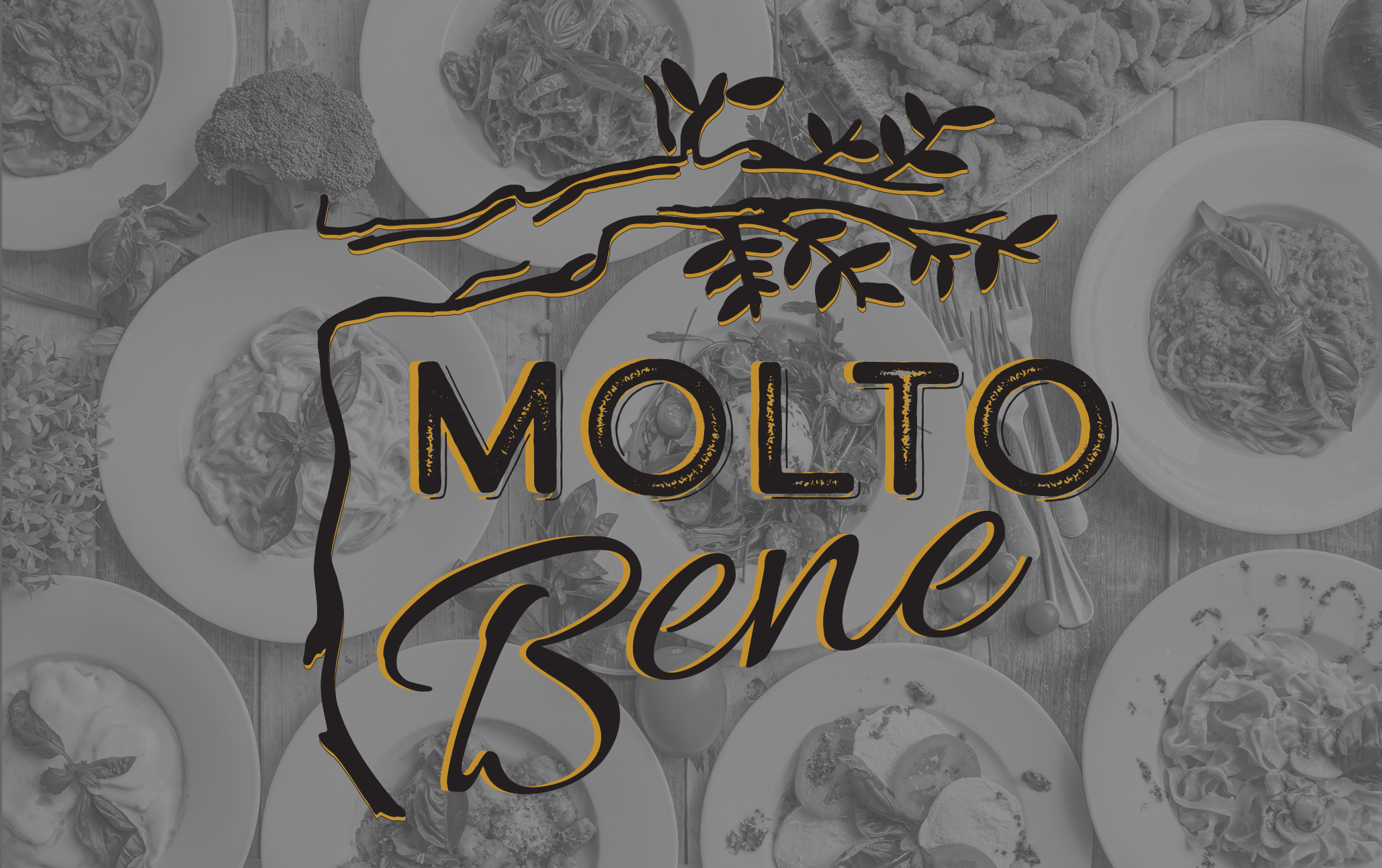
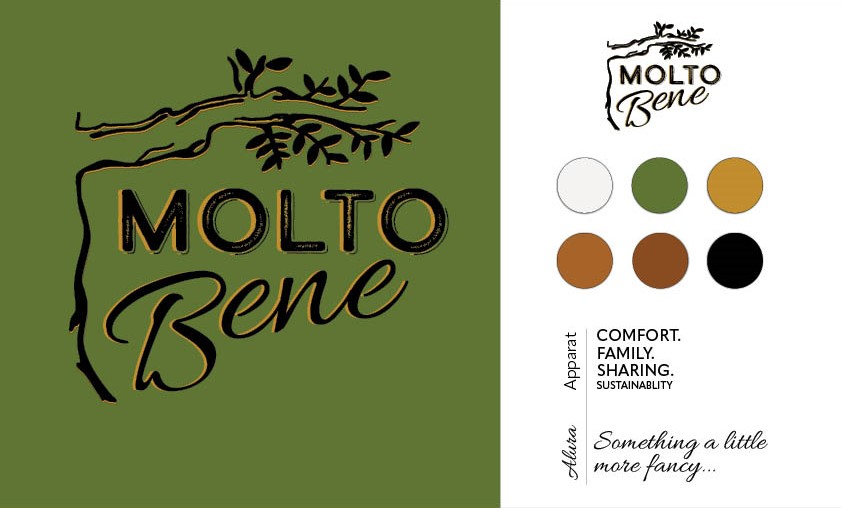
The textured typographic details and the olive tree are a nod to the Italian landscape. Reminiscent of sharing a meal underneath the olive tree in the Italian countryside. We paired this with cursive, textured and clean san serif fonts for overall feelings of tradition, authenticity, calm and comfort – all the things we get from a steamy bowl of pasta.
BRAND IDENTITY
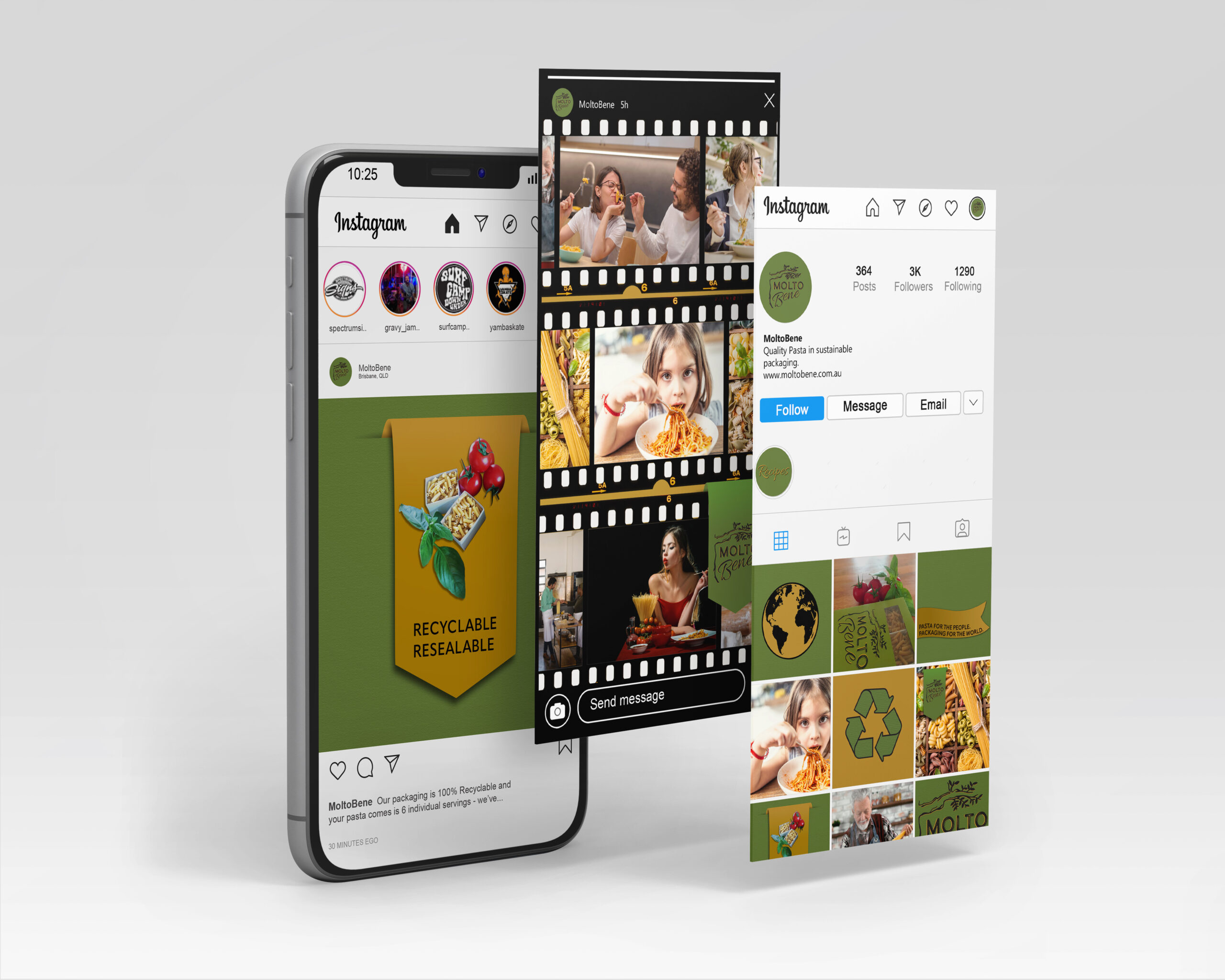
// A colour palette inspired by the golds, greens and browns found in freshly made pasta, herbs and the land from which it’s ingredients and people are grown.
// Typography choices – one modern and clean and trustworthy; one a “little more fancy” for those traditional Italiano feels.
PACKAGING DESIGN
Sustainability was the principle focus for this packaging design, followed closely by convenience, capacity to be easily stored and of course customer health and well being.
